Don’t Let An Outdated Website
Hold Back Your Growth
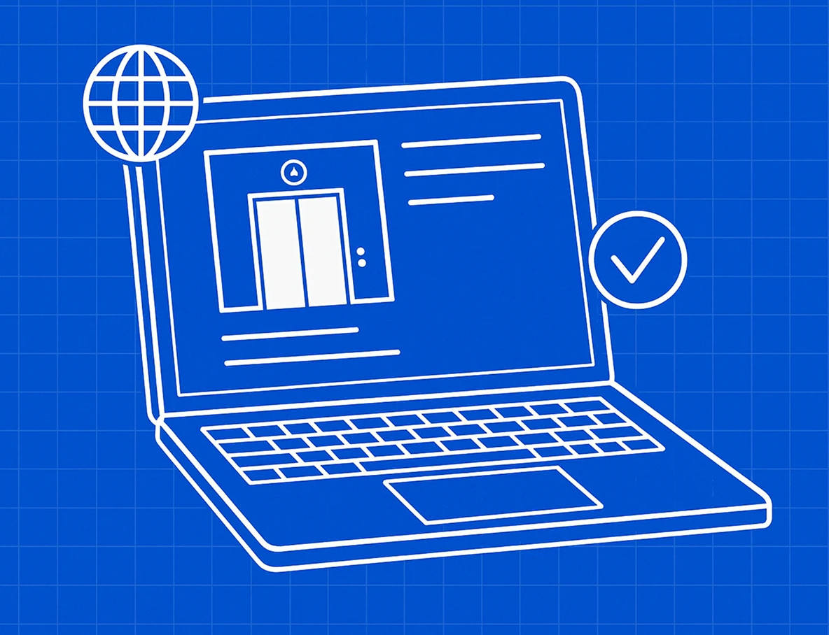
Work With Someone Who Knows Elevator Industry And
Understands How To Build Websites That Generate Results

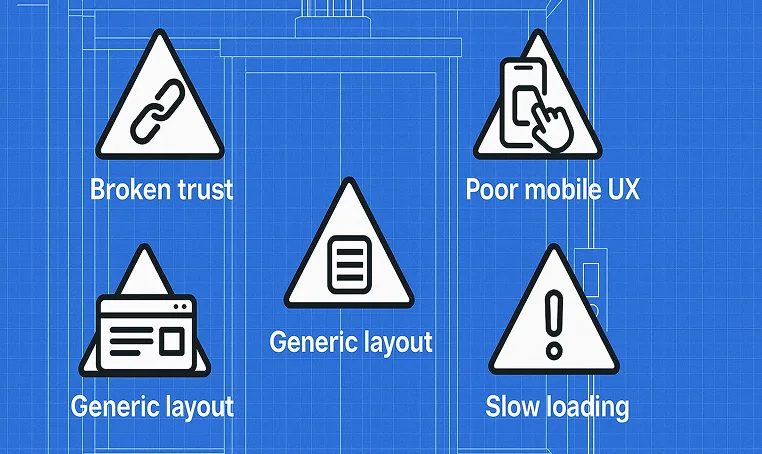
Avoid These Lead-Killing Website Flaws

If you’re in the elevator business, chances are you already have a website. And if you’re like most companies we’ve looked at, it probably looks… decent.
But here’s the kicker: Decent isn’t enough anymore.
A nice-looking site doesn’t guarantee trust. It doesn’t mean your visitors will reach out. And it definitely doesn’t mean you’re converting leads consistently.
Today’s customers—whether property managers, developers, or contractors—are digital-first. They’ll often decide whether or not to contact you before they ever pick up the phone. And your website plays a vital role in that decision.
We’ve reviewed dozens of elevator company websites—including ones we’ve redesigned at Digital Elevating—and the same problems come up over and over. The frustrating part? These businesses are great at what they do offline. Their work is solid. Their teams are skilled. But their websites don’t reflect that.
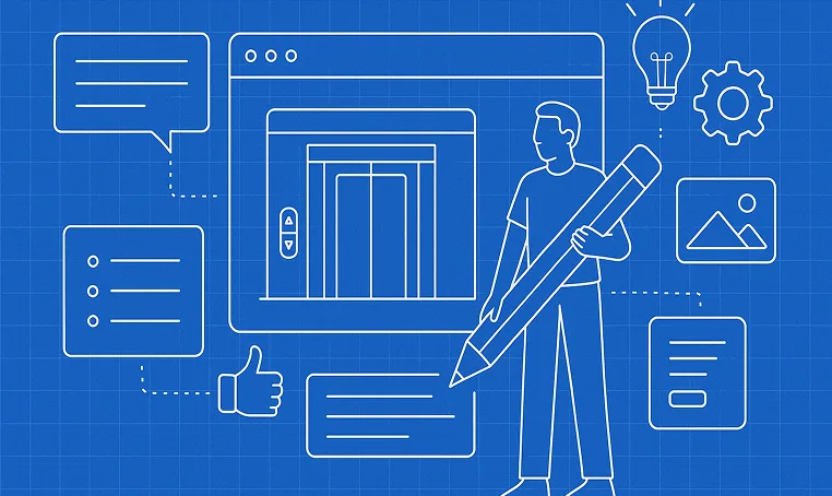
Let’s walk through five of the most common elevator website mistakes we see—and how to avoid them.
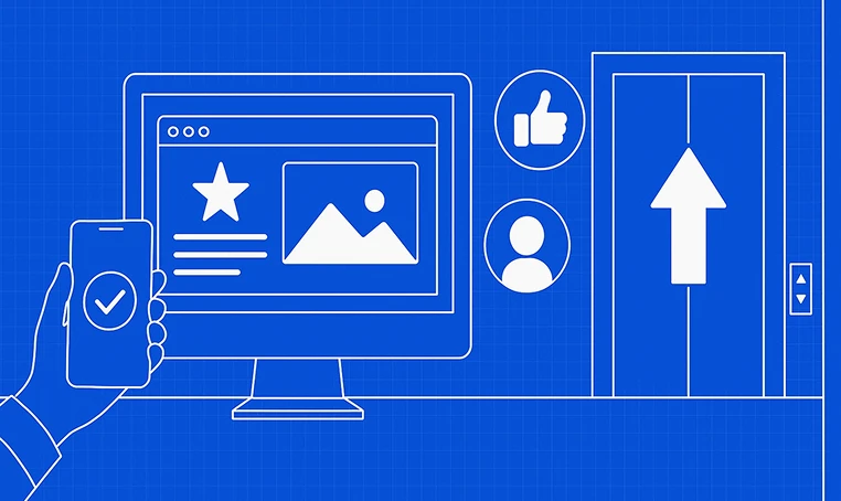
Too many sites in this industry are missing clear, visible calls to action (CTAs). There’s no “Request A Quote” button. No form. No direction. Just a logo, some paragraphs (sometimes entire essays), and a contact page buried in the footer.
You might think, “Well, they’ll call if they’re interested.”
But that’s not how it works. Visitors need to be nudged. They need a path.
A strong CTA should be above the fold (the first section you see when you load the page), after your main content sections, and in the navigation bar. Make them clear and outcome-driven — “Schedule a Free Inspection” beats “Submit.”
We recently reviewed a site for a reputable elevator service company in Ohio. They had great visuals and strong visuals, but no standout CTA above the fold. The only way to get in touch? A tiny “Contact” link in the footer.
That company was getting hundreds of visits a month—and converting almost none. One simple fix—a bold, action-oriented CTA in the header—started bringing in qualified leads within days.

Homeowners drinking morning coffee at their kitchen island. Property managers in elevators. GCs between meetings. All on their phones.
So when your site loads slow, your buttons are too tiny, or the layout breaks on mobile — you’re done. They won’t pinch-zoom to find your phone number. They’ll just back out and click the next guy.
One elevator contractor had a beautifully designed desktop site — but on mobile, everything broke. Text ran off the screen, buttons overlapped, and their phone number wasn’t clickable. The worst part? 70% of their traffic was coming from mobile.
Your mobile visitors aren’t patient. If the site doesn’t load fast and feel intuitive, they’ll bounce before you even know they were there.
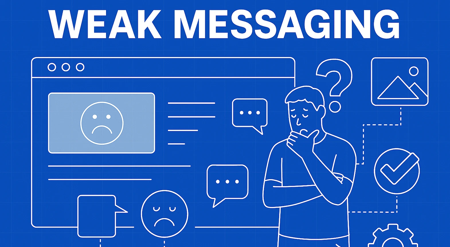
Stop Sounding Like Everyone Els
“We’re committed to quality.” “Family-owned.” “Reliable service.”
We’ve all seen it. These lines aren’t wrong — they’re just empty. They don’t show why someone should pick you, and they don’t make you memorable.
People want clarity and credibility. Add testimonials. Show real job site photos. Mention certifications like NAEC or NEII. Use copy that speaks directly to the client’s problem — not just how long you’ve been around.
You’ve done the work. Your website should reflect that.
If you’re not sure whether your site builds trust or just takes up space, get feedback from someone outside your team. Even small copy updates can make a big difference in lead generation — especially in a specialized field like elevator contracting.
It Works on My Computer” Isn’t Good Enough
Just because your website loads fine in the office doesn’t mean it performs well for someone on the go. And if it takes too long, they’re gone.
Even a 1-second delay can hurt conversions. A slow site feels broken, even if it technically works.
An elevator company in Florida came to us with a stunning-looking website — but a 74% bounce rate. After testing, we found it loaded in nearly 7 seconds on mobile. Big uncompressed images and bloated plugins were dragging it down.
We rebuilt it with speed-first structure. After launch, bounce rate dropped by over 30%, and call volume increased in the first two weeks.
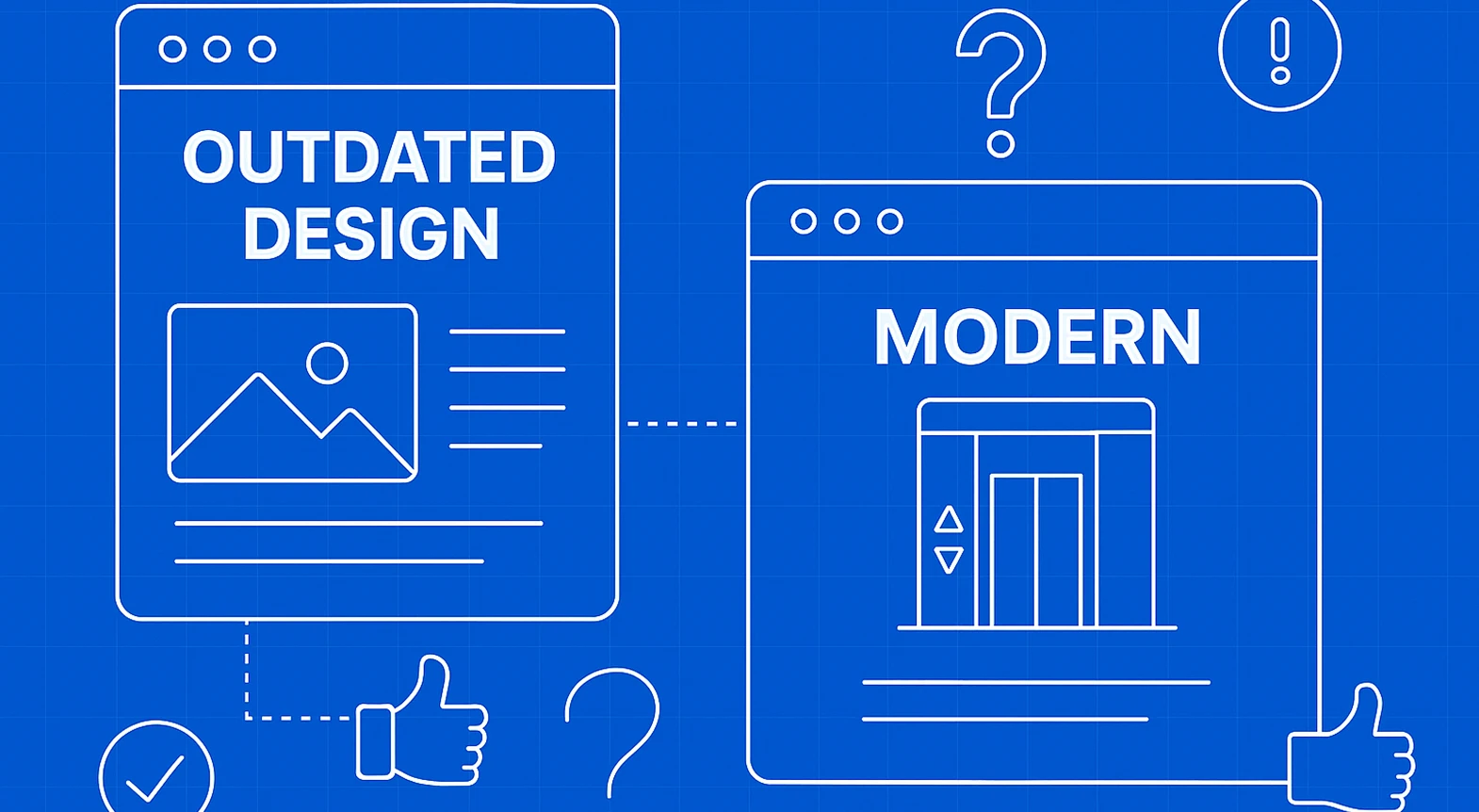
Your Website Is Saying More Than You Think
Even if you’re doing modern work, an outdated site tells visitors otherwise. Old fonts, crowded layouts, stock photos — they all add up to one big message:
“This company hasn’t evolved.”
It’s not always fair but it’s real.
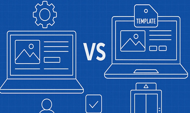
Update your visuals. Use space and typography to show professionalism. Ditch the templates and invest in something that reflects your actual quality.
A client we worked with had some of the best elevator modernization work we’d seen but you’d never know it from their website. Cluttered layout. Small text. Stock photos of random office buildings.
Once we redesigned it with real job photos, a modern layout, and bold clear headlines, they started closing deals directly from web inquiries.
If your elevator company’s website has any of these issues, you’re likely missing out on jobs, not because of your work; but because of your presentation.
Every day your website is live, it’s either helping you close the gap… or helping someone else win the job.
The good news? All of these issues are fixable. And when they’re fixed, your website becomes one of the most valuable tools in your business.
Want to see how we approach elevator websites with performance and trust in mind?Visit Digital Elevating to learn more.


1200+Satisfied Customers
If you’re an elevator company looking to improve your online presence, chances are...
Let’s be honest. Most elevator companies still get business the old-school way. Referrals...
Let’s face it. The majority of elevator company websites aren’t saying much. They list some...
If you're in the elevator business, chances are you already have a website. And if you’re like...
Most elevator contractors have a website. But here’s the real question, does it actually do...
Work With Someone Who Knows Elevator Industry And
Understands How To Build Websites That Generate Results